Best Fonts Designers Actually Use
Every designer has a go-to typeface they reach for when a client says 'just make it look clean' — and the debate over which one reigns supreme has fueled design-school arguments for decades. This list ranks the typefaces that actually show up in real studio work, from century-old serifs to modern geometric sans, based on how often they're chosen, trusted, and fought over. Cast your vote for the ty
What counts: Best' reflects a typeface's real-world adoption in professional design work — versatility across media, legibility on screens, availability, and iconic cultural status. Release years, designers, and classifications are historically documented; ratings are subjective approximations meant to spark deb
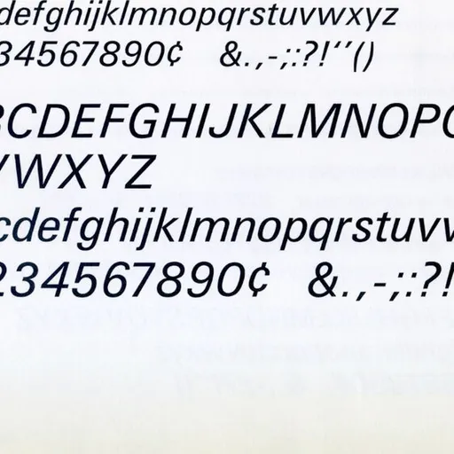
Helvetica
Born in Switzerland in 1957 as a neutral workhorse, Helvetica became the default typeface of corporate identity, subway signage, and Apple keynote decks alike. Its total lack of personality is exactly its superpower — designers reach for it when the message, not the type, needs t
Released: 1957Designer: Max Miedinger & Eduard HoffmannClassification: Grotesque sans-serifVersatility: 10/10Screen Readability: 8/10Free/Open Access: —Iconic Status: 10/10
added by Yourlist Editorial
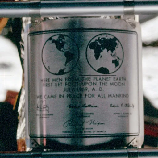
0Paul Renner's 1927 geometric sans, built from near-perfect circles and triangles, became the voice of modernism — it even flew to the moon on the Apollo 11 plaque. Designers love it for its confident, architectural precision in branding and headlines. Few typefaces feel this deli
Released: 1927Designer: Paul RennerClassification: Geometric sans-serifVersatility: 8/10Screen Readability: 7/10Free/Open Access: —Iconic Status: 9/10
added by Yourlist EditorialFutura
0Descended from 16th-century French punchcutting, Garamond's elegant, humanist curves have made it the go-to serif for book publishing for nearly 500 years. Designers trust it when a project needs warmth, legibility, and old-world credibility. It even became a punchline as 'the fo
Released: 1530sDesigner: Claude GaramondClassification: Old-style serifVersatility: 8/10Screen Readability: 6/10Free/Open Access: ✓Iconic Status: 9/10
added by Yourlist EditorialGaramond
0Adrian Frutiger's 1957 system of 21 coordinated weights and widths was a radical idea — one typeface family engineered to do every job consistently. It quietly became the backbone of countless corporate identity systems and airport signage. Designers who care about systematic thi
Released: 1957Designer: Adrian FrutigerClassification: Grotesque sans-serifVersatility: 8/10Screen Readability: 7/10Free/Open Access: —Iconic Status: 8/10
added by Yourlist EditorialUnivers
0Released in 1898, this is the grotesque that predates and inspired Helvetica and Univers — the true ancestor of modern Swiss design. Designers who want Helvetica's clarity but with a bit more idiosyncratic character often go straight to the source. It remains a favorite in editor
Released: 1898Designer: Berthold Type FoundryClassification: Grotesque sans-serifVersatility: 7/10Screen Readability: 7/10Free/Open Access: —Iconic Status: 8/10
added by Yourlist EditorialAkzidenz-Grotesk
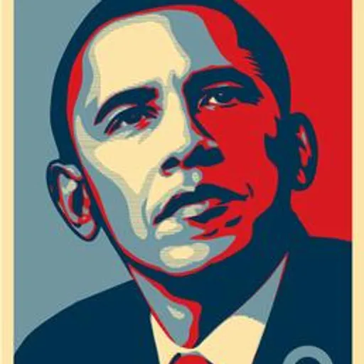
0Pulled from hand-painted New York City signage and refined by Tobias Frere-Jones in 2000, Gotham became the definitive American typeface of the 2000s — most famously carrying Obama's 'HOPE' campaign to victory. Its blocky, honest geometry reads as trustworthy and modern. Every br
Released: 2000Designer: Tobias Frere-JonesClassification: Geometric sans-serifVersatility: 8/10Screen Readability: 8/10Free/Open Access: —Iconic Status: 9/10
added by Yourlist Editorialin 2 rankingsGotham
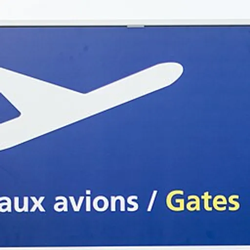
0Designed in 1976 for Charles de Gaulle Airport's signage, Frutiger's humanist sans became the gold standard for wayfinding, transit systems, and government IDs worldwide. Its legibility at a glance, even at odd angles and small sizes, is unmatched. Designers working in UI and pub
Released: 1976Designer: Adrian FrutigerClassification: Humanist sans-serifVersatility: 8/10Screen Readability: 9/10Free/Open Access: —Iconic Status: 8/10
added by Yourlist EditorialFrutiger
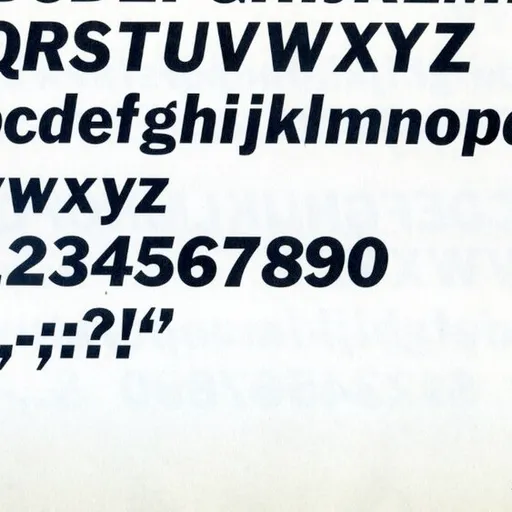
0Morris Fuller Benton's 1902 grotesque has powered American newspaper headlines for over a century, most visibly as the backbone of the New York Times' bold display type. It's blunt, sturdy, and endlessly reliable for editorial hierarchy. Designers reach for it when they need auth
Released: 1902Designer: Morris Fuller BentonClassification: Grotesque sans-serifVersatility: 7/10Screen Readability: 7/10Free/Open Access: ✓Iconic Status: 7/10
added by Yourlist EditorialFranklin Gothic
0Giambattista Bodoni's late-18th-century didone serif, with its dramatic thick-thin contrast, defined high-fashion typography from Vogue mastheads to luxury packaging. It's a font of pure drama — great for a headline, a disaster for body copy. Designers use it specifically when el
Released: 1798Designer: Giambattista BodoniClassification: Didone serifVersatility: 6/10Screen Readability: 5/10Free/Open Access: ✓Iconic Status: 8/10
added by Yourlist EditorialBodoni
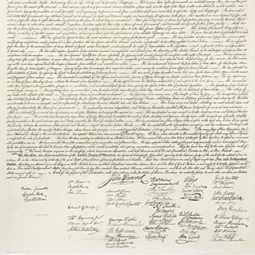
0An 18th-century English serif so trusted it printed the U.S. Declaration of Independence, Caslon carries a warm, slightly irregular charm that feels handmade even in digital form. The old design-world saying 'when in doubt, use Caslon' still gets repeated in studios today. It's t
Released: 1722Designer: William CaslonClassification: Old-style serifVersatility: 7/10Screen Readability: 6/10Free/Open Access: ✓Iconic Status: 8/10
added by Yourlist EditorialCaslon
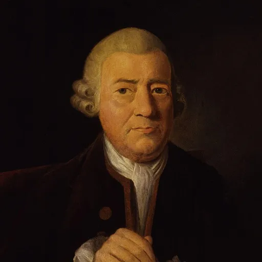
0John Baskerville's 1757 transitional serif pushed printing technology of its era to its limits, producing crisp contrast that scandalized contemporaries as too sharp. It became a favorite for academic publishing and prestige branding, prized for feeling both classic and quietly c
Released: 1757Designer: John BaskervilleClassification: Transitional serifVersatility: 7/10Screen Readability: 6/10Free/Open Access: ✓Iconic Status: 7/10
added by Yourlist EditorialBaskerville
0DIN
Standardized in 1930s Germany for road signs and technical documents, DIN's stripped-down, engineered look later got adopted wholesale by fashion and tech brands craving an industrial edge. Its rigid, no-nonsense forms feel purpose-built rather than decorative. Designers pull it
Released: 1930sDesigner: DIN Standards CommitteeClassification: Grotesque sans-serifVersatility: 8/10Screen Readability: 8/10Free/Open Access: ✓Iconic Status: 7/10
added by Yourlist Editorial
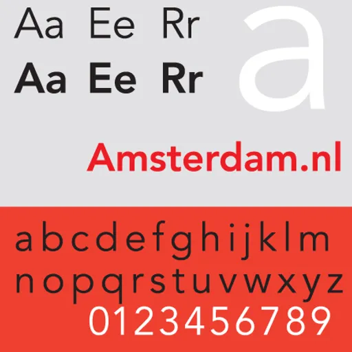
0Adrian Frutiger's 1988 attempt to perfect the geometric sans, Avenir ('future' in French) softens Futura's rigid circles into something warmer and more humane. It became a default for minimalist branding through the 2010s, especially in tech and lifestyle sectors. Designers pick
Released: 1988Designer: Adrian FrutigerClassification: Geometric sans-serifVersatility: 8/10Screen Readability: 8/10Free/Open Access: —Iconic Status: 8/10
added by Yourlist EditorialAvenir
0Matthew Carter designed Georgia in 1993 specifically to survive the crude pixel grids of early monitors, making it one of the first serifs genuinely built for screens. It quietly powered a generation of blogs and news sites before web fonts existed. Designers still credit it as p
Released: 1993Designer: Matthew CarterClassification: Transitional serifVersatility: 7/10Screen Readability: 9/10Free/Open Access: ✓Iconic Status: 7/10
added by Yourlist Editorialin 8 rankingsGeorgia
0Proxima Nova
Mark Simonson's 2005 release blends geometric structure with humanist warmth, and it exploded across startup branding and UI design in the 2010s so thoroughly it became a running joke about tech-company sameness. Its clean legibility at small sizes made it a default for interface
Released: 2005Designer: Mark SimonsonClassification: Geometric/humanist sansVersatility: 8/10Screen Readability: 9/10Free/Open Access: —Iconic Status: 7/10
added by Yourlist Editorial
0Jan Tschichold designed Sabon in 1967 as a Garamond revival engineered to print identically across different typesetting technologies — a technical feat as much as an aesthetic one. It became a quiet favorite in literary book design for its calm, even texture on the page. Designe
Released: 1967Designer: Jan TschicholdClassification: Old-style serifVersatility: 6/10Screen Readability: 6/10Free/Open Access: —Iconic Status: 6/10
added by Yourlist EditorialSabon
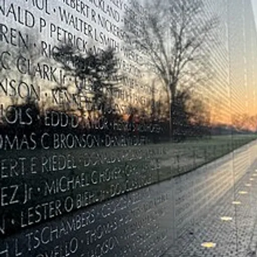
0Hermann Zapf's 1958 hybrid gives sans-serif letterforms a flared, serif-like stress, creating something that reads as both modern and classical at once. It found a lasting home in memorial engravings, museum signage, and prestige branding. Designers use it when they want elegance
Released: 1958Designer: Hermann ZapfClassification: Humanist sans-serifVersatility: 6/10Screen Readability: 6/10Free/Open Access: —Iconic Status: 6/10
added by Yourlist EditorialOptima
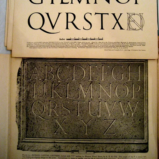
0Carol Twombly's 1989 design traces its capital letterforms directly from Rome's Trajan's Column, and Hollywood adopted it so heavily for movie posters it became a design-world meme ('Trajan is the movie font'). It has no lowercase, no apologies — pure monumental authority. Design
Released: 1989Designer: Carol TwomblyClassification: Display serif (capitals)Versatility: 4/10Screen Readability: 4/10Free/Open Access: —Iconic Status: 7/10
added by Yourlist Editorialin 3 rankingsTrajan
0