
Best team logos in sports
Sports logos are more than just branding—they're iconic symbols that ignite tribal pride, strike fear into rivals, and become instantly recognizable across generations of fans. From fierce mascots to sleek monograms, the best designs transcend their sport and become cultural touchstones in their own right. Which team's emblem reigns supreme? Cast your vote and defend your favorite.
What counts: The crowd's votes decide the order — seeded neutral.
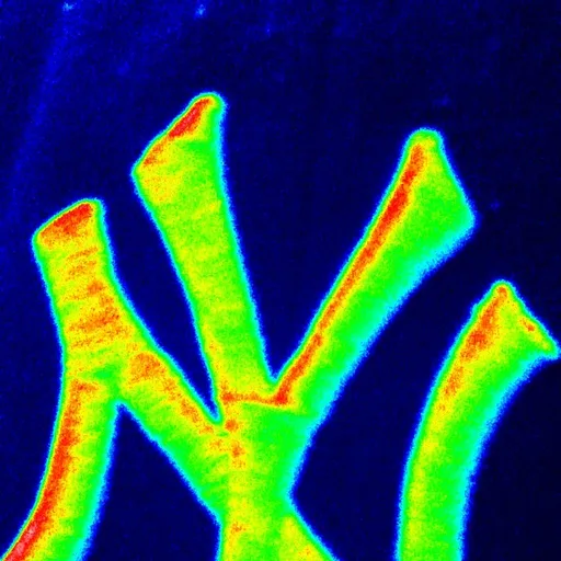
New York Yankees NY
Born in 1909 from a Tiffany & Co. design for a police medal of valor, the interlocking NY has outgrown its own sport to become shorthand for New York itself, stitched onto hip-hop album covers and Fifth Avenue storefronts alike. Its genius is restraint — no mascot, no color explosion, just two letters fused into a monogram so clean it reads as luxury branding. That's the case for the top spot: it's the rare logo that transcended being a logo entirely.'
added by Yourlist Editorial
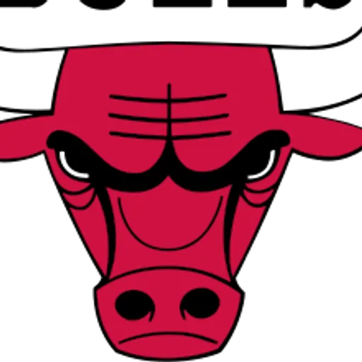
93Designed for a few hundred bucks in 1966, the snorting red bull became a global icon the moment Michael Jordan started wearing it, turning a mid-tier expansion franchise's crest into the single most bootlegged image of the 90s. The flared nostrils and jagged horns gave it an aggression no other NBA mark had, and it still sells more merch worldwide than teams with actual championship banners to match. It's the logo that a legend built an empire on top of, and that alone earns it a place near the summit.
added by Yourlist Editorialin 9 rankingsChicago Bulls
63Dallas Cowboys star
A single blue star, dead simple, first slapped on helmets in 1964 and never touched since — that permanence is the point. While rivals redesigned every decade chasing trends, the Cowboys let the star become interchangeable with 'America's Team' itself, visible from the nosebleeds and instantly legible on a Super Bowl ring. It belongs on this list precisely because it proves minimalism, done early and left alone, ages into timelessness.
added by Yourlist Editorial
37Montreal Canadiens CH
The interlocking CH, often misread as 'Canadian Hockey' but actually shorthand for 'Club de Hockey,' has barely changed since the 1910s and carries the weight of 24 Stanley Cups on its shoulders. It's less a logo than a religious icon in Quebec, painted on street murals and tattooed onto generations who never saw Rocket Richard play. Its argument for a top spot is pure gravitas — no other sports crest is this old, this unaltered, and this sacred to an entire province.
added by Yourlist Editorial
16Pittsburgh Steelers hypocycloids
Borrowed straight from the American Iron and Steel Institute's own mark in 1962, the three hypocycloids — yellow, red, blue — turned an industrial trade symbol into the only NFL logo that appears on just one side of the helmet, a deliberate quirk equipment manager Jack Hart insisted on to keep it 'fresh' from the back. That asymmetry became legend, a visual signature as unmistakable as the Steel Curtain defense it represented. It ranks here for turning literal factory branding into one of football's most recognizable emblems.
added by Yourlist Editorial
0Toronto Maple Leafs leaf
The 11-point maple leaf, redesigned in 2016 after painstaking historical research into every version the franchise had worn since 1917, deliberately echoes the leaf on Canadian World War soldiers' badges, tying the crest to national identity rather than just hockey. Conn Smythe's original insistence on the maple leaf as a symbol of pride during wartime gives it a weight no expansion-era logo can match. It's on this list because few marks carry this much unbroken historical and patriotic freight stitched into a single sweater.
added by Yourlist Editorial
-12Michigan block M
Adopted in 1938 and barely tweaked since, the bold, slab-serif block M is college football's platonic ideal of a helmet logo — no mascot, no gimmick, just a letter rendered so heavy and geometric it looks engraved rather than printed. Its winged helmet pairing with the M turned Michigan Stadium's sea of maize and blue into one of the sport's most photographed sights on any given Saturday. It earns its spot for showing that a single letter, executed with total confidence, can outlast a century of flashier rebrands.
added by Yourlist Editorial
-16Boston Red Sox B
A plain red 'B' on a white sock, introduced in 1908 and refined over decades into the crisp scripted letter now stitched on caps worn by people who've never seen Fenway Park. Its power is in ubiquity outside sports entirely — the Red Sox B has become a streetwear staple divorced from baseball, proof of a mark so simple it escaped its own context. That crossover into fashion, not just fandom, is why it deserves a seat at this table.
added by Yourlist Editorial
-20